
Enhancing Bacardi's PowerBI Dashboards
Transforming sales and activation business reports into a clear data storytelling . Elevating the hierarchical visual system that reduces cognitive load without sacrificing analytical depth.
About the project
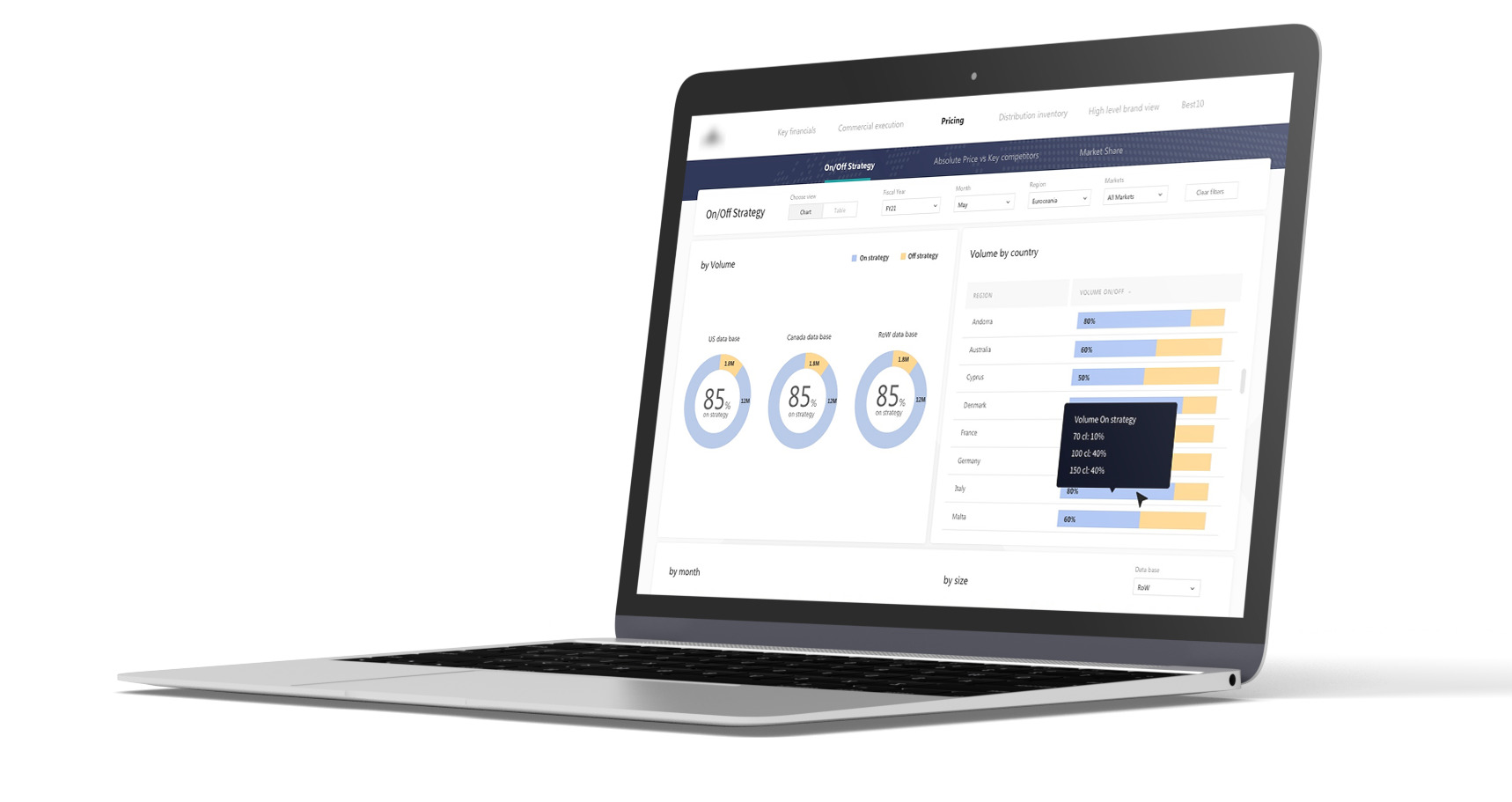
Introduced design-thinking process, making business-data approachable at a glance, without losing the analytical granularity stakeholders needed.
Bacardi's sales and operations teams relied on PowerBI dashboards to track regional performance, brand activations, and budget completion.
Outcome
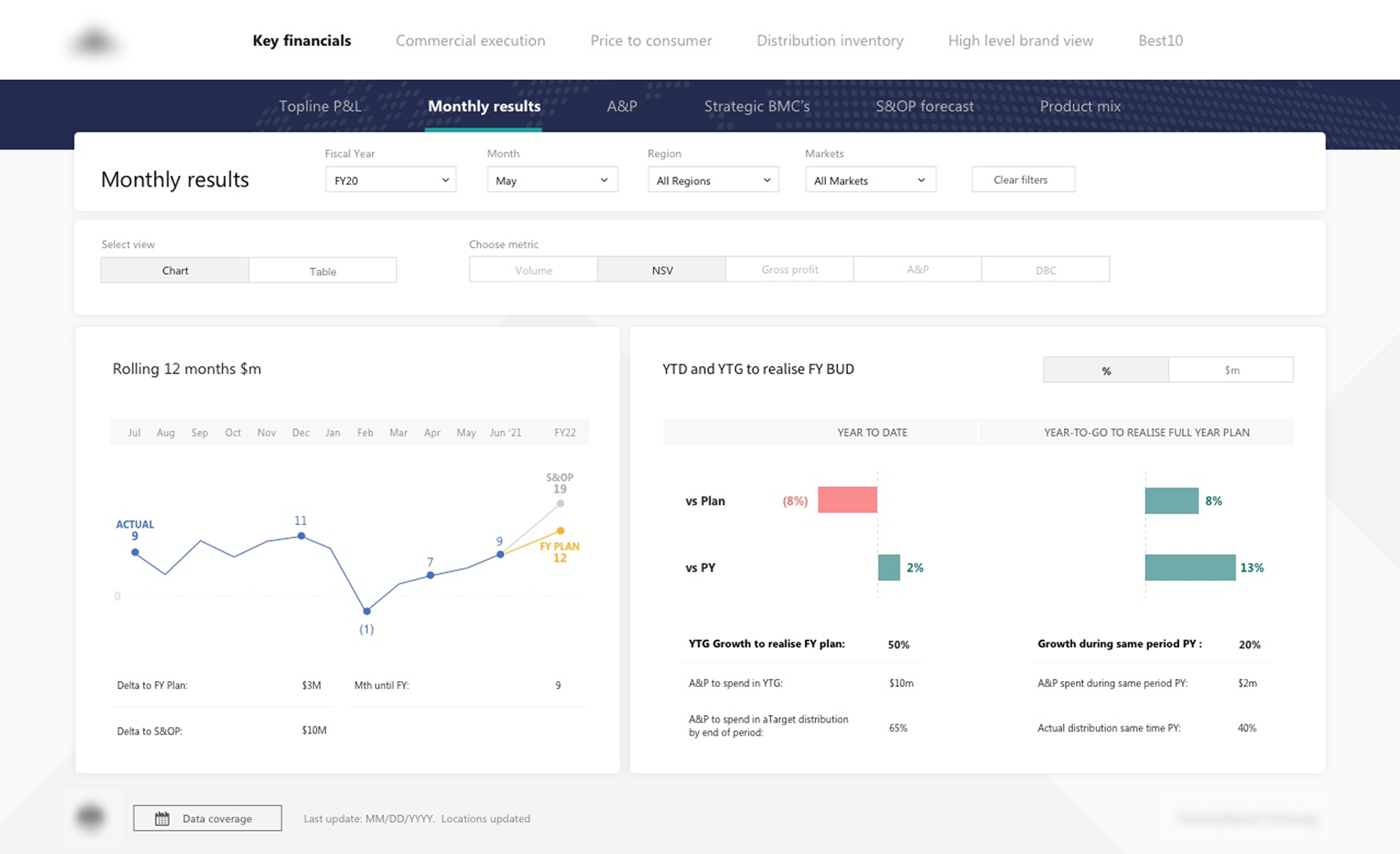
The narrative structure guides the user from general to specific, from the 12-month trend to the YTD (Year-to-Date) vs YTG (Year-to-Go )breakdown, enabling progressive reading without cognitive overload.
Visual hierarchy prioritization: using colour only to flag goals and deviations (yellow highlighting the plan; red bars for decline, teal for growth) while keeping the rest in neutral greys and blues.
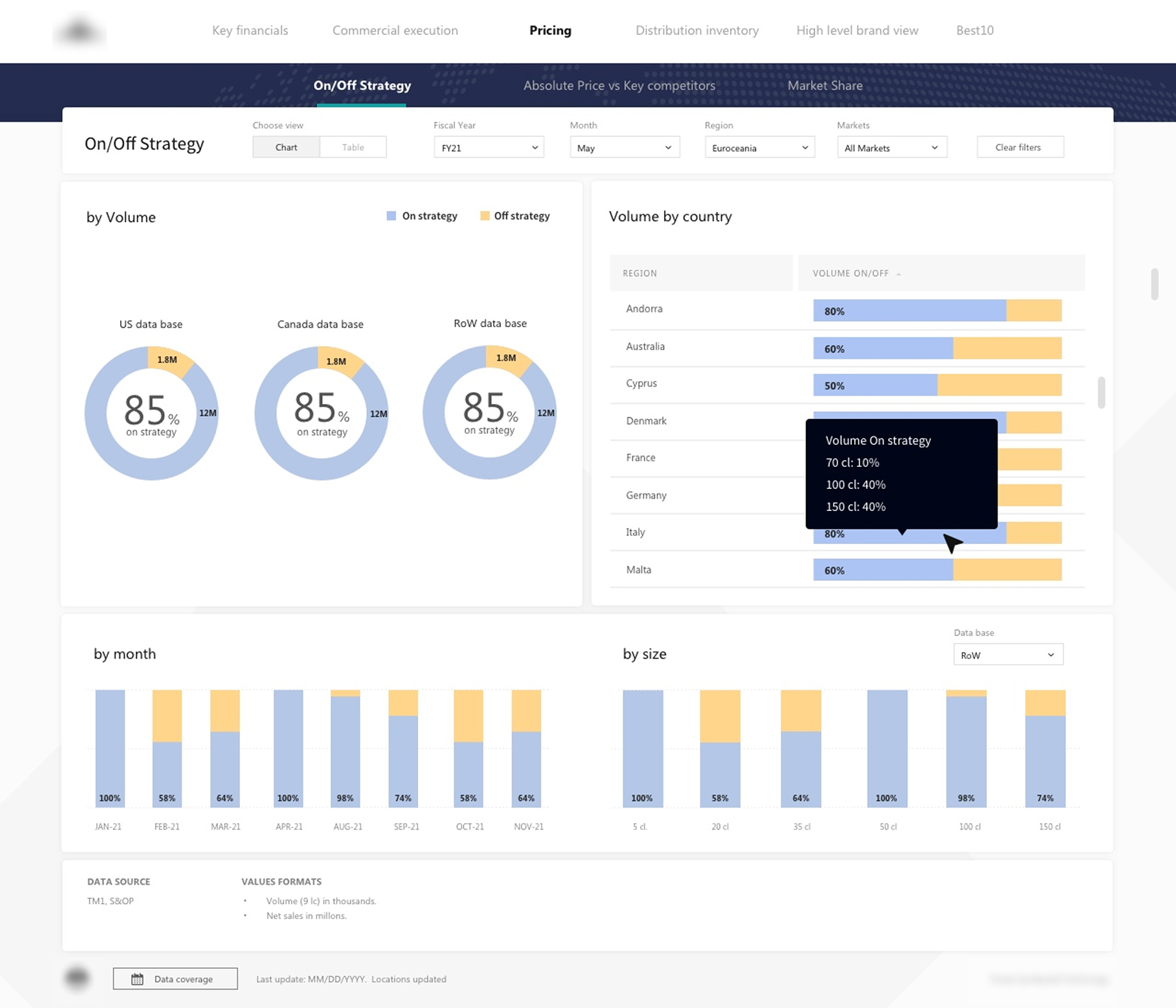
Continuing with the storytelling structure; from general to specific, from overall on/off-strategy performance by data base (US, Canada, Rest-of-World) to granular breakdowns by country, month, and package size.
Two-colour visual system (blue-neutral for on-strategy, yellow highlighting the off-strategy) was applied across all chart, letting the audience instantly recognise the same pattern regardless of the dimension being analysed.
The storytelling, layout, chart type and pallete were decisions made to reduce stakeholder's time in finding the answer they need.
Methodology
Audit
Heuristic evaluation of the existing reports against data visualization best practices (color theory, chart taxonomy, visual hierarchy), paired with stakeholder interviews to surface business priorities.
Synthesized findings into a prioritized backlog of pain points and improvement opportunities.
Simplify
Applied data storytelling principles to reduce layout complexity and establish information architecture and visual reading flow.
Low-fidelity wireframes, validated against business requirements and Power BI technical constraints.
Refine
Designed the visual language and a data-visualization-specific design system, chart types, components, design tokens, and core templates, engineered for scalability and reuse across reports.
Delivered high-fidelity mockups and full design system documentation, plus production-ready assets.
Industry
Spirits & Beverages.
IT technology.
Duration
4 months
Deliverable
End-to-end dashboard designs, visual system, charts standarization and components library.
Data storytelling, KPIs, data analysis.
Team
Working in synergy, validation loop:
Sales Lead EU: Stakeholder, validated business priorities and KPIs definitions.
PowerBI Data Analyst: Partnered on feasibility, data structure, and technical constraints.
Design & Data Visualization: Self-led. Owned the design process end to end.
Key takeaways
Design Belongs in Data Workflow
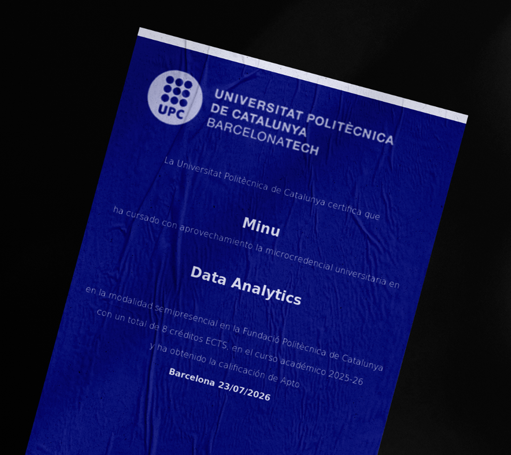
The seed that led me to formally study and get certified in Data Analytics, was this project. Since then my goal has become to keep embracing data science with design methodology.